Identity redesign, 1997 to 2026
We kept the meaning and rebuilt the form.
Emma Groups carried nearly thirty years of meaning in a logo that could not be reproduced. This is the whole redesign: what was wrong, the four directions we drew, how each one held up at real sizes, and the system that shipped.
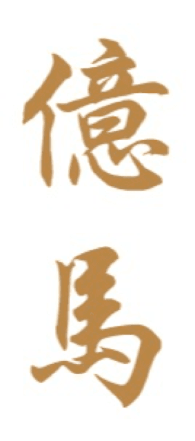
1997, as supplied
2026, shipped
What was wrong with it
- 01
It existed only as a 134 by 303 pixel JPEG with a white box behind it. No vector, no transparency.
- 02
The proportion was roughly 1:2.3 vertical, which cannot sit in a website header, a letterhead or a site hoarding.
- 03
There was no Latin wordmark at all, so an English reading client or a foreign architect could not read the company name from the logo.
- 04
Soft brush strokes in pale gold read as calligraphy or hospitality, not as structure. It fought the category.
- 05
Gold on white had weak contrast, so it disappeared at small sizes and vanished entirely over photography.
What the characters mean
億 is abundance. 馬 is the horse that carries the work. Together they read Yi Ma, the way Emma is written in Chinese, and they have been on the company’s documents since 1997. Nothing about that was worth throwing away. The question was only how to carry it into a form that reproduces.
Four directions
Each one was drawn as vector and tested at real sizes before anything was chosen.
A roofline over four posts. Read as a house it is the pitched form of a landed home. Read as heritage the four posts are the four strokes at the foot of 馬.
Two ideas in one shape, and it survives to 16 pixels. Selected.
The 馬 character reconstructed on a strict grid inside a bronze chop. The most direct link to the existing identity.
Beautiful on a plaque or a hoarding. Turns to mush below 32 pixels.
An A frame with a bronze tie beam. Clean and unambiguously structural.
The most generic of the four, and the outline disappears at favicon size.
No symbol at all. The name carries the identity, with the original 億馬 kept alongside as a heritage endorsement.
Bulletproof at every size. Kept, as the favicon and app icon.
The test that decided it
A contractor’s mark spends most of its life small: a browser tab, a hard hat sticker, a document header. Every direction was rendered at 64, 32 and 16 pixels rather than judged at poster size.
Gable and Four
64 · 32 · 16
Seal
64 · 32 · 16
Frame
64 · 32 · 16
Datum
64 · 32 · 16
The result.Gable and Four survives to 16 pixels because it is four rectangles and a chevron. Datum is bulletproof at every size. Seal turns to mush below 32, and Frame loses its outline entirely. So Gable and Four became the identity, and Datum’s E tile was kept for the sizes where even that is too fine.
The system that shipped
Primary lockup
Mark alone
Favicon and app icon
Reversed, for dark grounds and photography
Where each asset goes
- Horizontal lockupWebsite header, letterhead, email signature, vehicle livery
- Mark aloneHard hat stickers, site hoarding, social avatar, watermark
- E tileFavicon, app icon, and anywhere the full mark would fall below 24 pixels
- Heritage 億馬Company chop, Chinese language documents, footer endorsement
The wordmark is drawn, not set
Every letter in the name is built from straight lines, so a geometric construction with a single stroke weight gives a mark that is free to own, reproduces at any size, and reads as measured and structural. It carries no font licence and no missing font risk on a contractor’s own office machines.
The palette
The bronze is the existing gold, desaturated and darkened until it holds contrast on white, on graphite and over photography. It stays recognisably their colour, so the change reads as a sharpening rather than a rebrand.
Your move
Let’s talk about your build.
If you have drawings, a site, or just a plan taking shape, we would like to hear about it.